 |
||
Grateful Dead Album CoversThe Golden Road '65 - '70The band's self titled debut was released in 1967. This is the first of many Grateful Dead album covers that would be created by the immortal team of Stanley Mouse and Alton Kelley. They were already well known for helping to redefine what could be done with rock poster art and here they begin to do the same with album cover art. The collage was done by Kelley and the photos they used were taken by Herb Greene. I think the photos are interesting because everyone looks so young. Check out Phil's hair - it almost looks like he's wearing a wig! And it's neat to see Jerry before the beard became a permanent fixture. 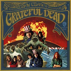 At the top of the cover there is a quote from the Egyptian Book of the Dead. It says "In the land of the dark, the ship of the sun is drawn by the Grateful Dead." You can't really see it here and even if you could it's nearly impossible to decipher the stylized lettering. Grateful Dead Album Covers - Anthem Of The Sun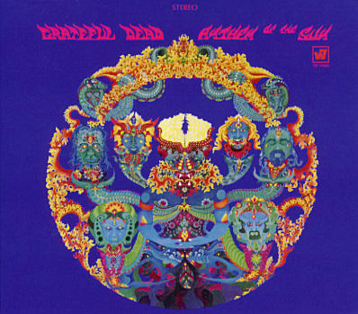 Anthem of the Sun, released in 1968, has one of my favorite Grateful Dead album covers. It was created by Bill Walker who was a friend of Phil Lesh and Tom Constanten. His fantastic painting features each of the band members faces on a multi-headed fire-breathing beast that looks like it was inspired by a Hindu god. Walker, a talented artist who is also an excellent writer, has written a 33 page essay about the painting which can be found on his website. According to Walker the multi-headed dragon which is the central figure in the painting is intended, among other things, to represent "the entity which sometimes manifested itself at a Dead show, when the Band and the audience seemed to achieve a transcendent state of rapport and unity..." He goes on to write one of the most eloquent descriptions of "it" - the magic that happens at a show - that I've come across in many years of reading about the band. I found his story of the design process fascinating. First he describes the initial drawing which formed the basis for the painting: "The drawing took a little over a week of very intense participation. Most often I had no awareness of day or night and recall eating only a few times" He says it "unfolded intuitively and spontaneously. I didn't have to think about what I was going to draw - it literally projected itself out of my head onto the canvas. I had the sense that my eyes were merely transferring, out of a boundless and radiant space, the image onto the canvas, and all I had to do was effortlessly delineate or play the patterns I was seeing on the canvas." Then he writes about the painting: "The aspiration of the painting process was to delineate, in a flat area of about 6.5 square feet, a transcendental experience of profound radiance, and harmony of being." He goes on to write about the many different layers of the design and their meaning for him. The essay is very interesting reading, especially if you like descriptions of peyote trips and various other mind altering experiences. The painting was actually still unfinished when the band was ready to release the album but Walker decided it would be alright to use it as it was. He then put the painting aside and didn't return to it until 1989. He finally finished it in 1996 - over 27 years later! You can see the finished painting at his website Billzart.net Grateful Dead Album Covers - Aoxomoxoa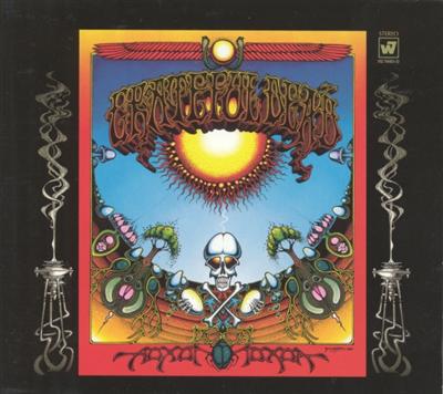 Aoxomoxoa was released in 1969 and features one of Rick Griffin's finest Grateful Dead album covers. The painting was originally created as rock poster art advertising the Dead at the Avalon Ballroom in January '69. It's one the greatest and most highly sought after psychedelic posters ever. I recently saw a first printing for sale at Wolfgang's Vault
The band liked the poster so much that they asked Griffin to rework it for the cover of their third album. The colorful cover is ripe with many of his favorite images. There are potent fertility symbols everywhere you look. The sun at the center looks like an egg being attacked by sperm. There's the embryo, womb and fetus. You can see sprouting seeds and some very phallic looking mushrooms. There are Egyptian religious figures such as the scarab and the winged solar disk. Also present is a skull and crossbones which adds to the theme of death and rebirth. One of Rick Griffin's greatest talents was lettering and he would sometimes include hidden messages in his art. It's not obvious at all but the phrase Grateful Dead can also be read as We Ate The Acid. You have to look closely and sort of let words blur together. This really impressed me - I'm not an artist but I imagine it's not easy to create lettering that can be interpreted in two different ways.  The album was originally titled "Earthquake Country" but Griffin was fascinated with palindromes so he and Robert Hunter suggested Aoxomoxoa instead. The band liked it and the name stuck. Rolling Stone Magazine featured a list of the 100 greatest album covers of all time in 1991 and ranked it as number 8. While I usually find these lists to be completely arbitrary, in this case I'd have to agree. It's a true classic from one of the most brilliant and revolutionary artists of the time. If you're interested in purchasing any of Rick Griffin's poster art you can find it all at Wolfgang's Vault
Grateful Dead Album Covers - Live/Dead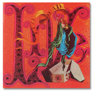
Bob Thomas painted the cover for the band's 1969 album Live/Dead. He was a good friend of Owsley and a talented graphic artist. He was responsible for several important pieces of Grateful Dead art including the band's steal your face logo and the famous dancing bears. They appeared in his album cover art for Bear's Choice. The painting is another classic of 60s psychedelic art. I think it captures perfectly the medieval atmosphere of the Live/Dead musical suite. The "climbing arms of ivy" from the St. Stephen coda appear to decorate the large lettering of the word "live" in the background while a beautiful woman (possibly the muse?) rises from an open coffin carrying a banner emblazoned with the name of the album. Considering the band's name it seems appropriate that the cycle of death and rebirth is a recurring theme in Grateful Dead album covers. According to Owsley, Thomas had a knack for painting in such a way that you could see certain hallucinogenic patterns in his artwork when viewed while high on acid. I wouldn't be surprised if there was something similar going on here. Grateful Dead Album Covers - Workingman's Dead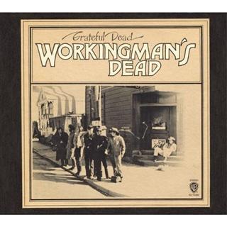
Released in 1970, Workingman's Dead displayed another of the Grateful Dead album covers created by Mouse and Kelley. The sepia-toned photo features the band dressed as cowboys and lined up in the street like the magnificent seven. It resembles a scene straight out of a classic western. I think it perfectly matches the down to earth feel of the songs on the album which were a major departure from the band's established style. According to the liner notes from the reissue included in the Golden Road boxed set, Alton Kelley brought the band to the Mission District in San Francisco and photographed them with an old Kodak Brownie camera to achieve the desired effect. The band members from left to right are: Robert Hunter, Jerry Garcia, Bob Weir, Phil Lesh, Mickey Hart, Pigpen (Ron Mckernan) and Bill Kreutzmann. Apparently it was extremely hot the day of the photo shoot and Billy got impatient and sat down in the doorway of that store to find some shade. As luck would have it the photo actually works better that way giving it the feel of Main Street in a western frontier town just before a gun fight. |
    |
|
 [?] Subscribe To This Site
 |
||
|
All written material (except lyrics) copyright 2012 Live Grateful Dead Music.com
All images copyright their respective owners. |
||
|
| ||


New! Comments
Have your say about what you just read! Leave me a comment in the box below.